Workstream, 2023
Unified platform
When a business pivot brings multiple discrete experiences into one single app, how might we structure a unified platform?
Role: End-to-end product design
Team: Product Manager, UX Researcher, Lead Product Designer*
Timeline: 4 months
Navigation for a complex app
Users tell us that the mobile app is confusing: our feature set is large, desktop-centric, and continually growing. It makes it hard to complete critical tasks.
On top of this, our stakeholders are concerned that we cannot scale to future needs for prospective users.
How might we scale our navigation?
Based off of that, my goal was for our navigation to get the current mobile user to what they need to do, in a way that was scalable and consistent.
To measure if we were successful in this or not, we observed users as they attempted to complete the critical tasks and recorded both qualitative feedback and quantitative metrics.
*Although my Lead Product Designer advised me in certain areas, I owned this project. Unless otherwise stated, all work that I mention in this case study is my own work.

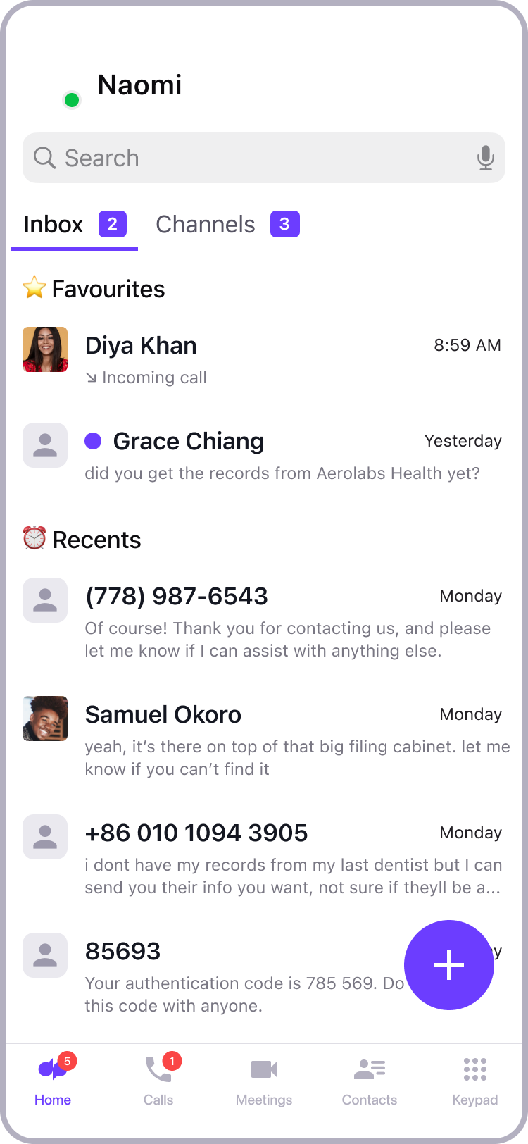
Final design as shipped on iOS.
Feature growth has lacked strategy
Dialpad’s bread and butter is its business phone product, giving each user their own phone number that they can use to make phone calls and send text messages. Typically, customers use Dialpad to call or text their clients.
But the past couple of years has seen expansion in Dialpad’s communication features like video calling, call centers, sales enablement and more.
While each feature added value for customers, each individual launch didn’t take into account all the others. Moreover, the feature launches were highly focused to the desktop experience. This all created a confusing navigation structure on the mobile clients.

Desktop and mobile navigation before the design intervention.
I started with trying out some initial IA (information architecture) structures, and sketching out some rough possible layouts, but I realized that I really didn’t know enough about our users, so I started working with my UX researcher.

Deciding my research methods
I knew the research questions that I needed answers to:
What is the user’s mental model of Dialpad?
What tasks do users choose to do on mobile over other platforms?
These are the biggest unknowns in creating our new navigation; but I leaned heavily on my UX Researcher to help me understand the best ways to find the answers to my research questions.
An open card sort ended up being the clearest way to understand our customers’ mental models, while customer interviews helped get a clearer sense of our customers’ workflows.
What we learned
We ran our card sorting exercise through OptimalSort, which also generated great visualizations of the results. It turns out that users’ mental models use groupings of conversation type, which is radically different from our current navigation structure.
In our interviews, we learned that mobile-heavy users are often multitaskers. They take advantage of the mobile form factor move around both physical and virtual spaces.
It’s not that particular tasks are more or less likely to be done on mobile. It’s more so that the nature of a lot of the careers who are more likely to use mobile require them to do all of their seated tasks also on the go.

Understanding the user journey
This gave me enough information to run a user journey mapping session with my team. Now that we understood more clearly the mobile user’s day-to-day workflow, we were able to map out their user journey and identify where their critical tasks were.
Most importantly, this journey mapping allowed us to identify key moments where we could surface relevant new features that might have otherwise been buried or inaccessible in the old navigation.

Telling the story
With the knowledge of our users expectations from their mental model, and the critical tasks that they perform throughout their workday, I was able to make informed decisions on how to categorize information in the app and where to locate key actions.
Since the interactions involved mostly using stock navigation components like a bottom tab bar, my prototype focused on telling the story of the typical mobile user, so that stakeholders could understand the reasoning behind these design decisions.
Validating decisions
After launching this feature in early access beta, our participants had strongly positive qualitative feedback, particularly around the call list which matched more closely with their expectations.
My next steps are to evaluate this from a quantitative perspective by looking at how much I’ve reduced the time to complete certain critical tasks.
What I learned
I discovered opportunities to collaborate with the Growth team, which is a function I hadn’t previously had the chance to work with. Our research participants commonly cited Dialpad’s license structure as the key limitation to their adoption of certain collaboration features: for example, customers were reluctant to buy extra Dialpad licenses simply to allow their employees to chat with one another.
It’s my first time to be able to identify a business growth opportunity like this, and I’m currently learning a lot about how Product Design and Growth can work together.